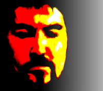
After selecting an image I want to paint, I import it into photo editing software to finalize the composition and determine where I want the light and dark areas to be separated. I change the image very often in order to simplify and refine the basic shapes. The goal is to end up with a digital image composed of 3-6 different shades of gray, like this:
An example of the digital step in my process.
Next, I decide what colors I will use for the lights, darks, and mid-tones. This is, of course, subject to change at any point in the process. Interpret that how you will, but the reality is simple. Some days I can mix up a nice green or purple. Some days I can’t.
Depending on how accurate I want the work to be, I will use either a grid or a projector to transfer the image to pre-stretched watercolor paper. I have heard of artists using graphite paper to do this, or even light tables, but a digital projector was the most economical option for me. Probably the neatest as well. Who wants to mess around with 22×36″ graphite paper?
If I want anything to remain pure white, I will use latex masking to protect it. (These areas are becoming fewer and smaller in my work as time goes by.) The entire paper then gets a subtle wash of color to ‘knock back’ the brilliant white.
From there the process is pretty simple. I start with the lightest area and fill it with color. Then I move to the next darkest and so on, until I am finished.
Depending on the piece, I may or may not use more latex masking and possibly even wax paper to protect areas already painted.
After I am satisfied with the colors, I let the piece dry and remove all the masking.
The final step is making (hopefully) small adjustments and corrections. If I am lucky, these are just spots where the masking cover a bit too much, or a few errant drips of color have to be lifted out (or even incorporated into the image.
Recent Comments